Traffic Manager UX Research
Employer: NTT Data (2023)
Overview
Our assignment from the client was to redesign their traffic manager platform for their autonomous warehouse robots (forklifts and tow trucks). This effort included creating UX flows, a component library, and a fresh style guide for the application.
The traffic manager’s main purpose is to give a bird’s eye view of all autonomous vehicle activity throughout a customer’s site. The application consists of two main parts: an interactive map of the site and a dynamic panel where users can change site settings and enter information.
Once we completed the designs for version 1.0, we needed to validate our assumptions with real users. My role was to lead this user testing effort.

Interactive Mapdynamic panelPersona & Goals
The persona we chose to focus on for our research is the installer because they interact most with the application. The installer’s main job is to map out a customer’s site inside the traffic manager with paths and locations that are to be used by the robots.
Our 3 main goals were:
Test our assumptions about the structure and layout of the application
Understand the jobs to be done by installers and determine if our tools enable those jobs to be done effectively and efficiently
Validate nomenclature and icons used in the interface

Persona profileUser Test Planning
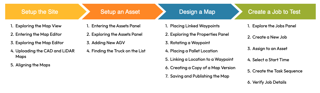
Because we only had an hour with each participant, we decided to limit our user test activities to 4 specific areas. We called these are our jobs to be done. Each job contains tasks that an installer would sequentially complete when setting up a new site for a customer. The jobs to be done are displayed below.
My responsibilities during this stage
Recruitment of research participants from within the client’s company
Scheduling testing sessions within our timeframe
Planning out the tasks/activities for each job to be done
Writing the interview script for user testing sessions
Creating the prototype UX flows in Figma to be used during the user testing sessions

Question flow for one of our user testing prototypesUser Testing Sessions
In total, we ran 10 user testing sessions. Participants varied in their job title and experience with the traffic manager platform, but they were all asked to engage with the program from the perspective of an installer.
The interview was conducted on a Microsoft Teams call and structured into walkthroughs with 5 different prototypes. For each prototype, participants were asked initial questions about the section they were in. This included topics such as:
Thoughts on the layout
Thoughts on the icons and nomenclature
General feelings about the application
To get a sense of participants thoughts on the application structure, we also tested the validity of our interactions within each section. We asked probing questions like:
“Where would you click in order to get to X?”
“Why did you think clicking there would do X?”
“Did the process of doing X make sense to you?”
To conclude each testing session, we asked participants their thoughts about the application overall. We also sent them a link to a quick post-interview survey so we could collect some quantitative data.
Example user testing prototype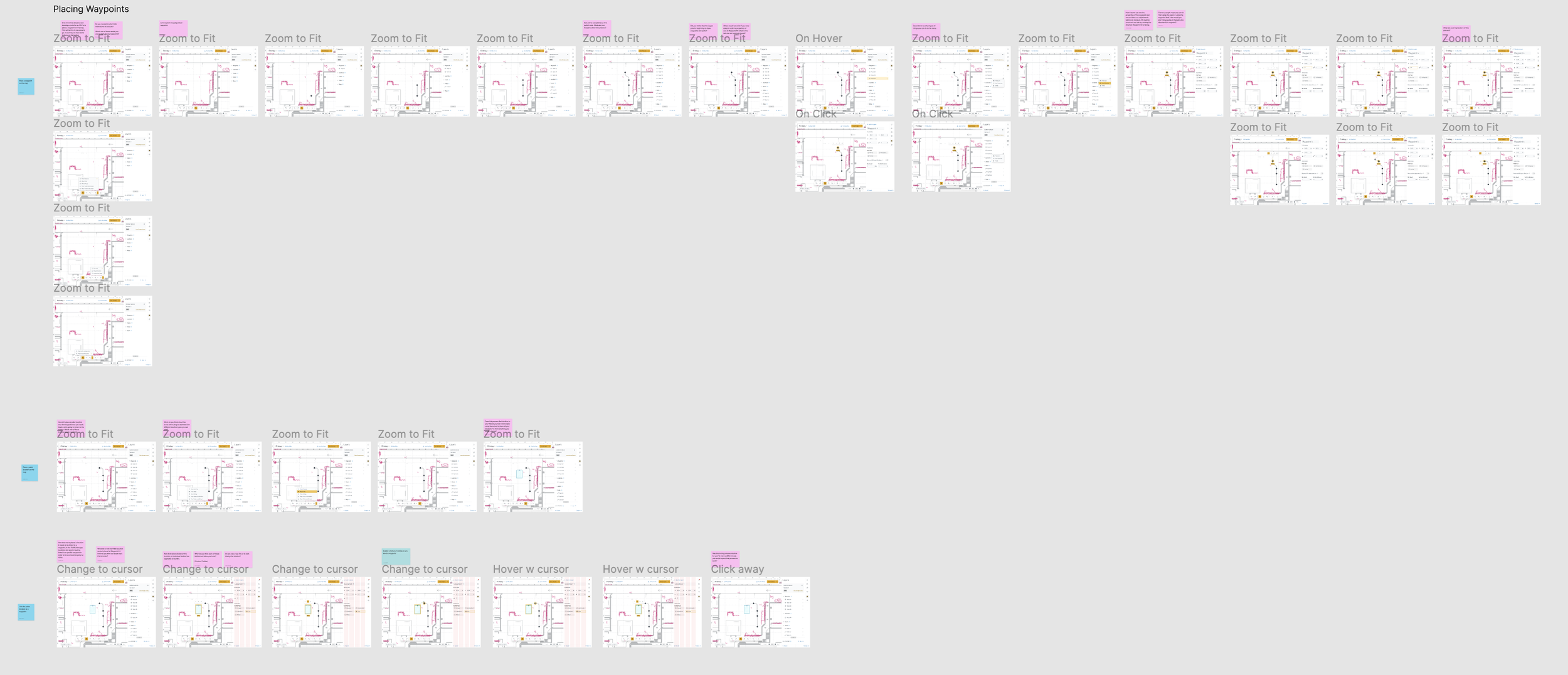
Full prototype flow laid out in figmaData Analysis & Results
To synthesize our data from the user testing sessions, we used Dovetail to tag each interview recording for sentiment analysis. This process helped us to identify common pain points and moments of delight for different features of the traffic manager. Tagging in Dovetail also lets us to identify which overarching sections of the application needed the most refinement.
Additionally, analyzing the interview data in this way allowed us to capture and organize specific suggestions that participants may have gave during their testing sessions.

chart of most common pain pointsWhen then organized all of our findings into a report. The report contains detailed insights into the feedback we received for each section of the application as well as the necessary improvements to make them more usable. We also delved into our research process and methodology.
Here is the high level executive summary of our research findings:
Overall feedback was positive: Our Information Architecture Hypothesis held true and the order of tasks we led participants through was accurate
Some key pain points must be addressed before release: Aligning the CAD map, assigning jobs to a robot, and saving/publishing the map need major improvements
There are some minor usability hiccups: Some icons needs to be reevaluated, nomenclature needs to be adjusted for certain features, and the number of clicks can be reduced in a few areas.

Overview of feedback for a section of the application
Detailed insights for a section of the applicationThe final segment of the report detailed the next steps for how we plan to implement the most important changes based on our research.
Our design team’s plan of action consists of 3 steps:
Confirm the prioritization of improvements for version 1.1 with the wider team
Tackle the low-effort, high need improvements
Tackle the higher effort improvements
